Case Study: Successful Nonprofit Dashboards in Action
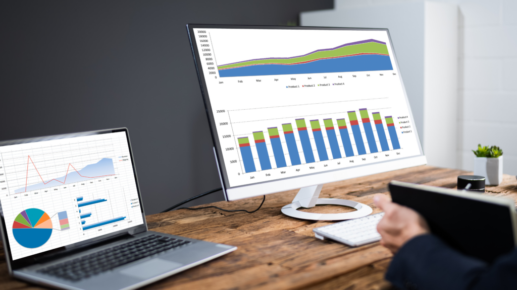
In the modern world of data-driven decision-making, nonprofits are increasingly turning to sophisticated dashboard solutions to enhance their operational efficiency and impact. Dashboards provide a real-time overview of key metrics, enabling organizations to track progress, identify trends, and make informed decisions. This case study explores several examples of nonprofits that have successfully implemented dashboards, showcasing how they’ve leveraged this technology to achieve their mission-driven goals.
Case Study 1: Global Health Initiative
Overview: The Global Health Initiative (GHI) focuses on improving health outcomes in underserved regions through research, education, and direct intervention. With multiple programs running simultaneously, GHI faced challenges in tracking their various initiatives’ progress and outcomes.
Solution: GHI implemented a customized dashboard that integrates data from multiple sources, including health clinics, field reports, and donor contributions. The dashboard features interactive visualizations and real-time updates, allowing stakeholders to monitor health metrics, program effectiveness, and financial health.
Impact: The dashboard has significantly improved GHI’s ability to manage resources and make strategic decisions. For instance, they identified a region where health interventions were lagging and promptly redirected resources to address the gap. Additionally, the visual representation of data has enhanced transparency and facilitated better communication with donors.
Case Study 2: Education for All Foundation
Overview: The Education for All Foundation (EAF) aims to provide quality education to children in developing countries. They run numerous educational programs, including school construction, teacher training, and scholarship schemes. EAF struggled with the complex logistics of coordinating these programs and measuring their impact.
Solution: EAF deployed a dashboard that consolidates data from various educational projects and regions. The dashboard includes metrics on student enrollment, program participation, and educational outcomes. Features like geospatial mapping and trend analysis help EAF visualize program reach and effectiveness.
Impact: The dashboard has enabled EAF to streamline program management and make data-driven decisions. By tracking enrollment and retention rates in real-time, they identified successful strategies and replicated them in other regions. Additionally, the ability to visualize geographic data helped in optimizing resource allocation.
Case Study 3: Environmental Conservation Network
Overview: The Environmental Conservation Network (ECN) is dedicated to protecting natural habitats and endangered species. With numerous conservation projects and a large amount of environmental data to manage, ECN needed a robust solution to keep track of their efforts.
Solution: ECN introduced an advanced dashboard that aggregates data from field surveys, satellite imagery, and donor records. The dashboard offers detailed insights into habitat conditions, species populations, and funding levels. It also includes forecasting tools to predict future conservation needs.
Impact: The dashboard has transformed ECN’s ability to monitor and respond to environmental changes. It has facilitated more effective project management by providing a comprehensive view of conservation efforts. The forecasting tools have been particularly useful in anticipating challenges and planning proactive measures.
Leave a Reply
- AI in Diagnostics: Revolutionizing Early Detection and Accuracy
- How AI and Advanced Analytics Are Transforming Healthcare Outcomes
- Investing with Confidence: The Role of ROI Calculators
- How ROI Calculators Drive Data-Driven Business Strategies
- The Ultimate Guide to ROI Calculators for Business Success
- Making Sense of ROI Calculators: A Comprehensive Guide
- June 2025 (1)
- May 2025 (1)
- October 2024 (2)
- September 2024 (31)
- August 2024 (31)
- July 2024 (27)
- June 2024 (28)
- May 2024 (30)
- April 2024 (33)
- March 2024 (23)
- February 2024 (29)
- January 2024 (3)
- December 2023 (47)
- November 2023 (36)
- October 2023 (23)
- September 2023 (2)
- June 2023 (2)
- May 2023 (13)
- April 2023 (1)


